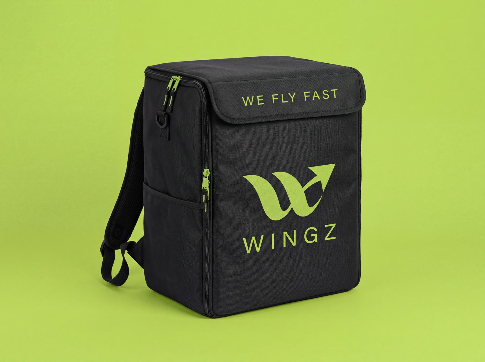
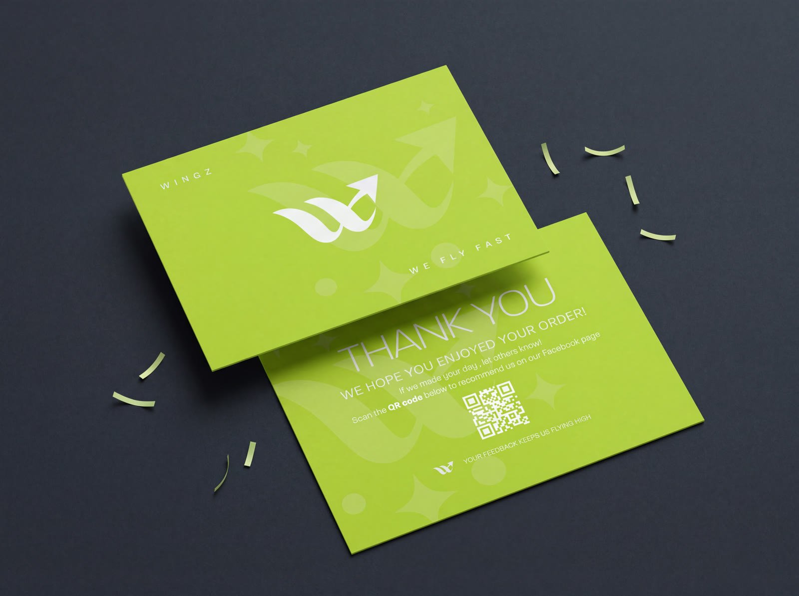
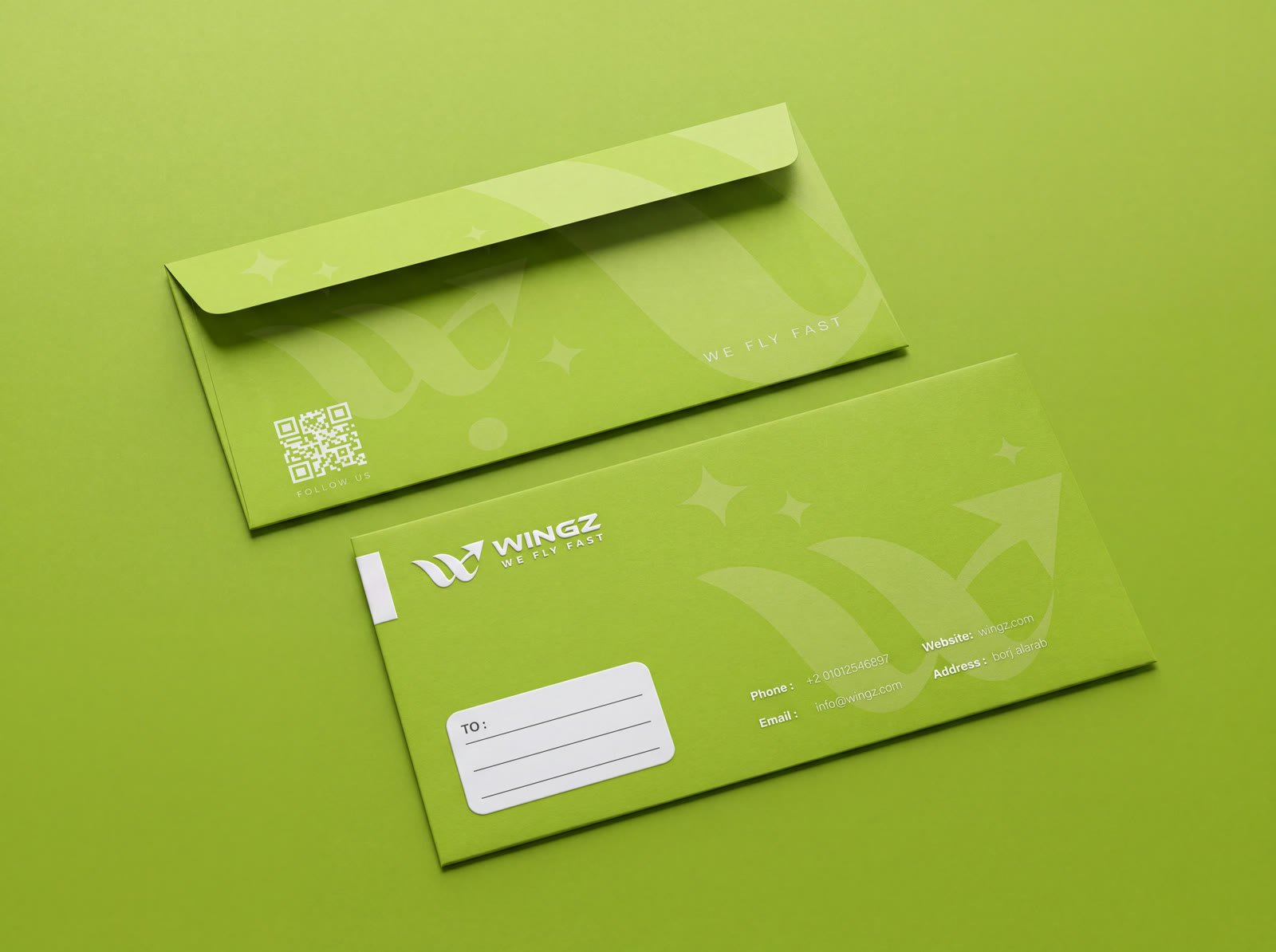
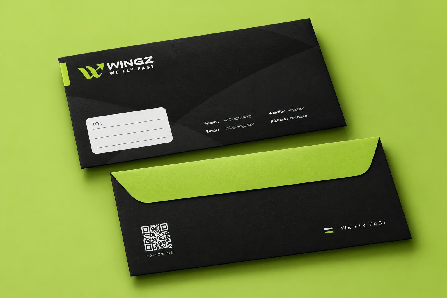
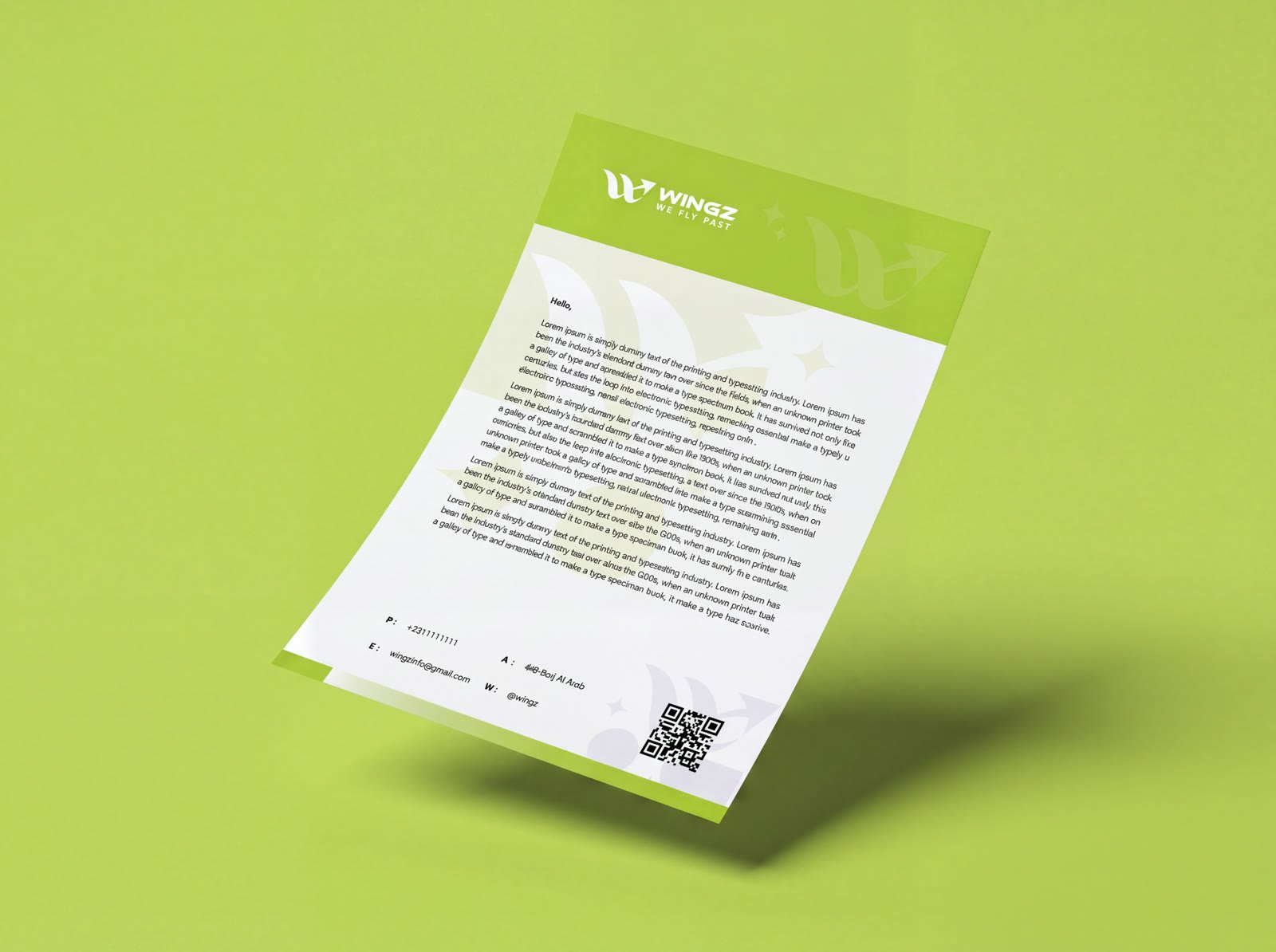
A fast food delivery service built around a simple promise — we fly fast — carried through a lime-green wing mark and a system that runs from the delivery rider's bag to the business card.
Wingz's whole pitch is speed, but nothing about the old brand said "fast" — no consistent mark, no system, nothing that separated it from every other delivery app on someone's phone.
Our job: build a wing-shaped mark energetic enough to earn the name, then apply it across stationery, packaging, social and the rider's own delivery bag — a system the team could run without us.
Every decision made against the strategy, then handed over as usable tools.
Wingz now looks as fast as it delivers — the same mark on the rider's bag, the invoice, and the thank-you card that lands with every order. "We fly fast" finally has a brand behind it.
Customers recognise the bag before the rider even knocks. That's the brand doing its job.